Dashboards and Business Intelligence

Operations Workflow Dashboard

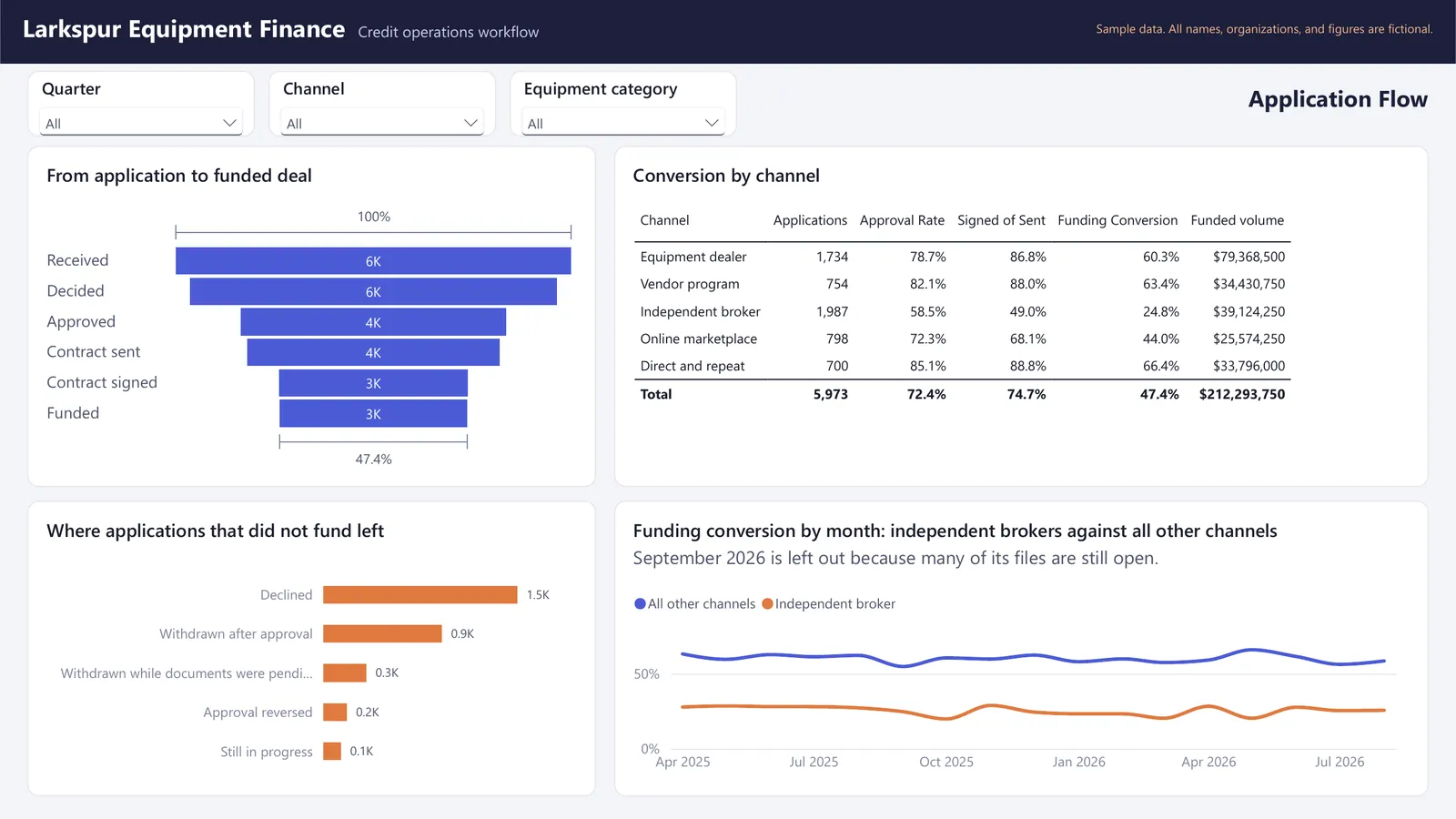
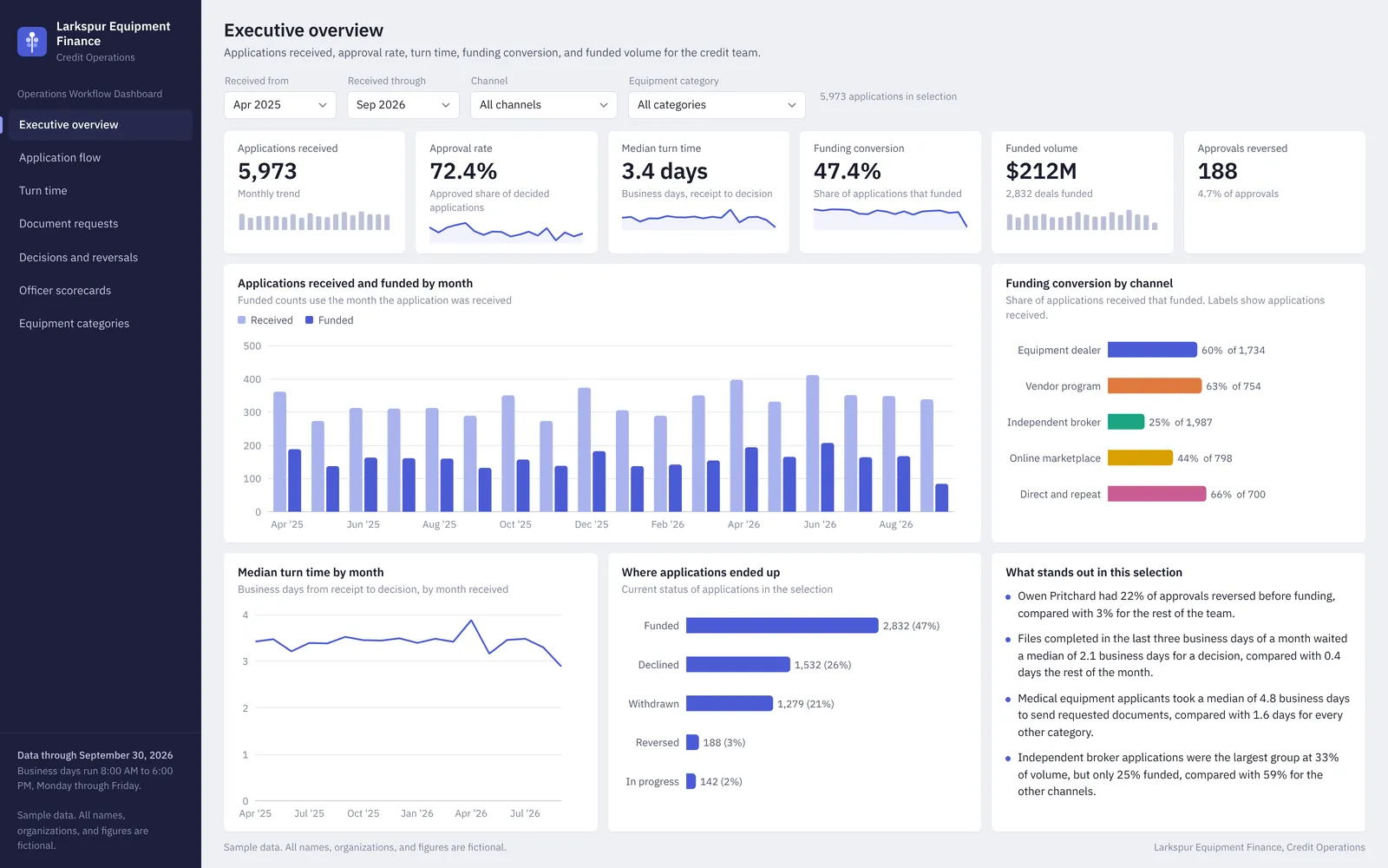
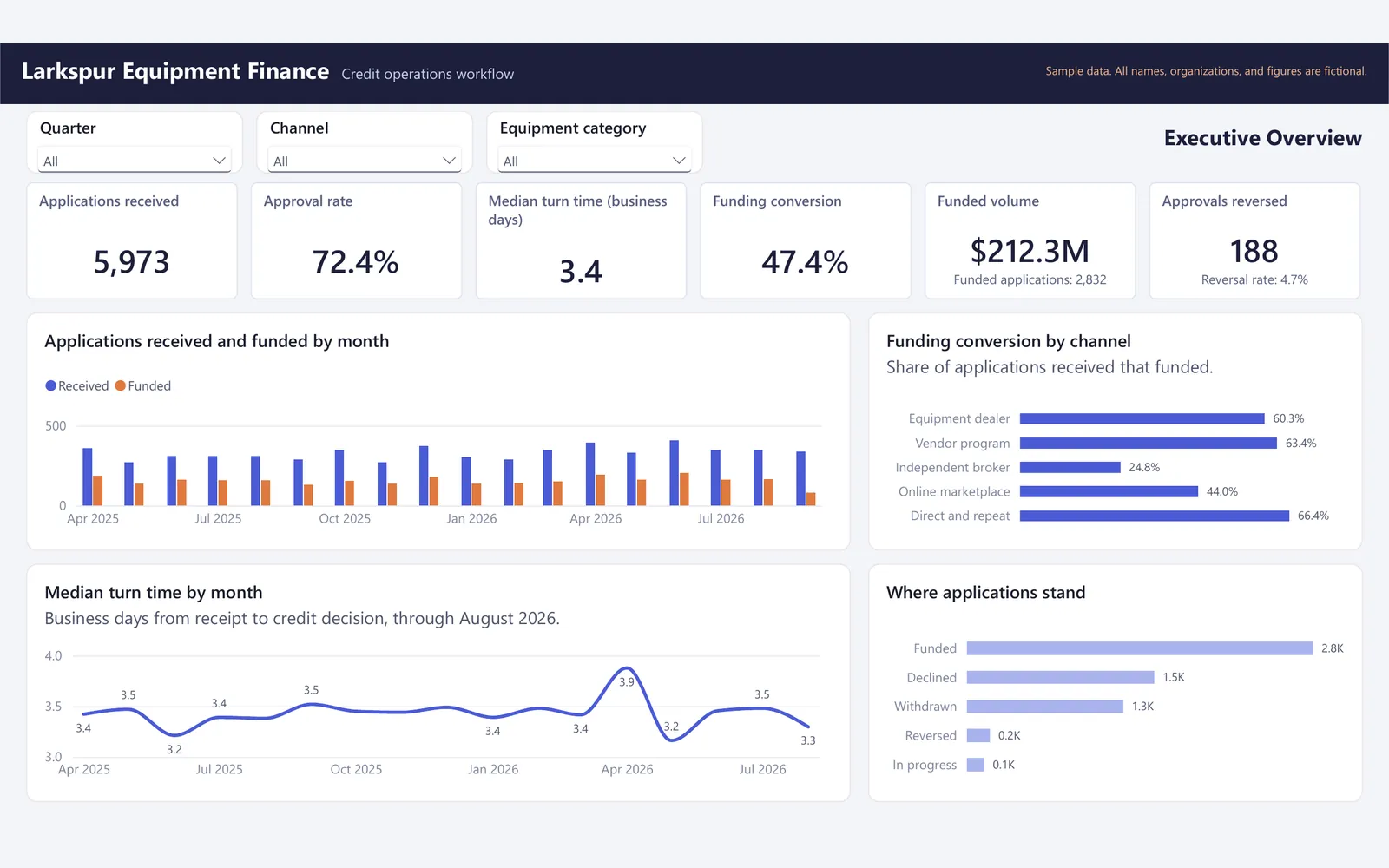
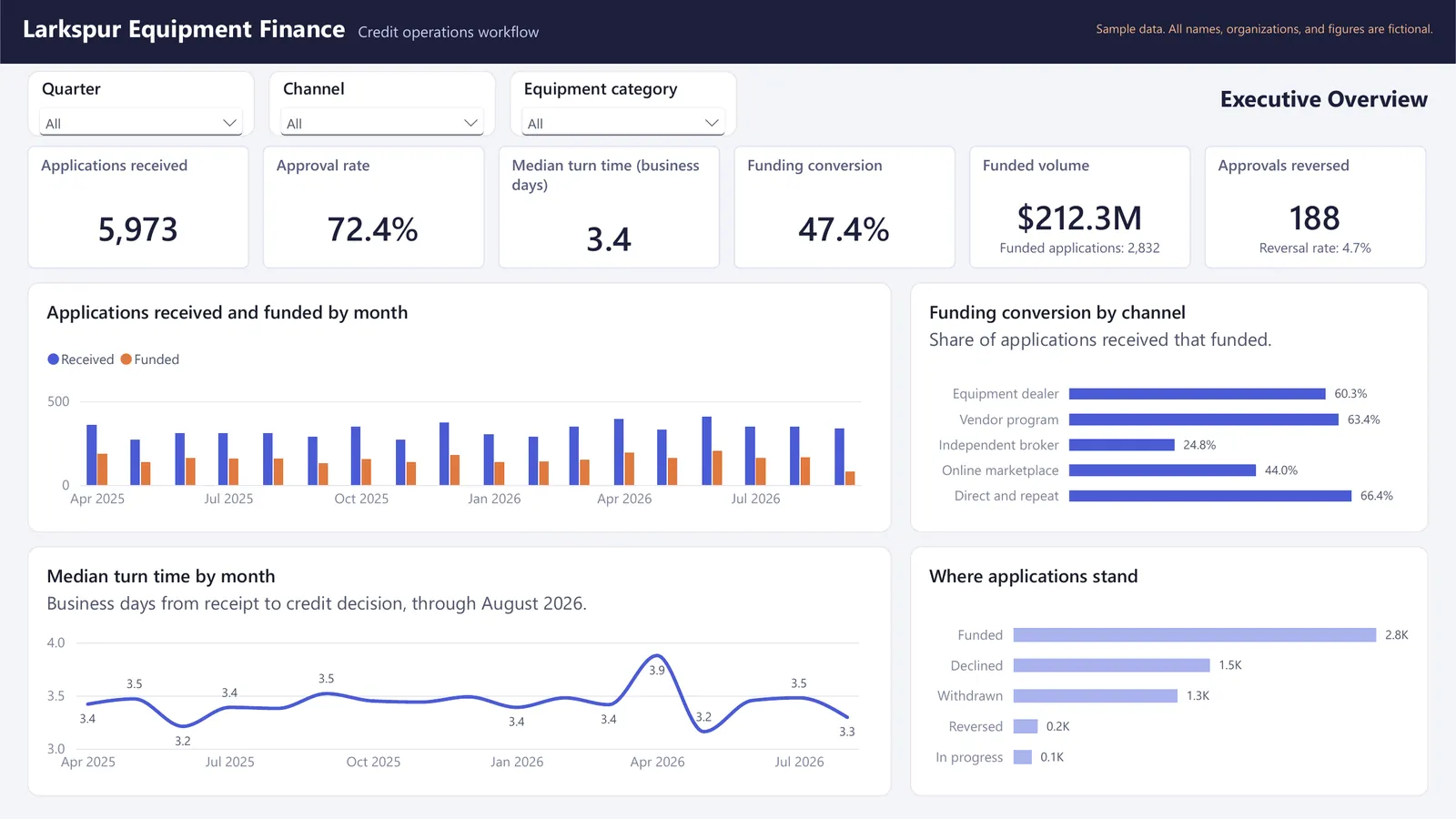
This is a seven-page operations dashboard for the credit team of a fictional equipment finance company. It tracks about 6,000 applications, 47,000 workflow steps, and 9,600 document requests over 18 months, and it shows turn time, document waits, decisions, reversals, and funding conversion.

Sample data. All names, organizations, and figures are fictional.

Operations Workflow Dashboard: Powerbi overview operations workflow dashboardOpen larger image

About this sample

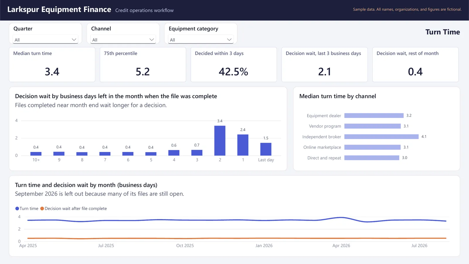
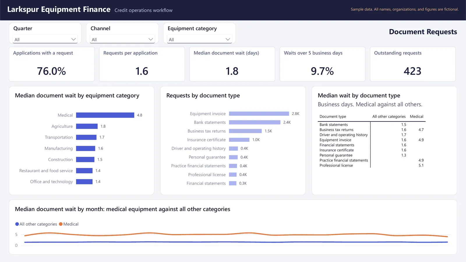
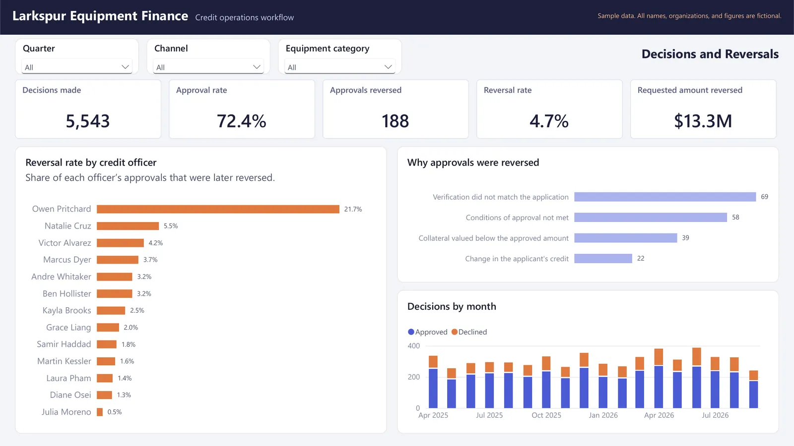
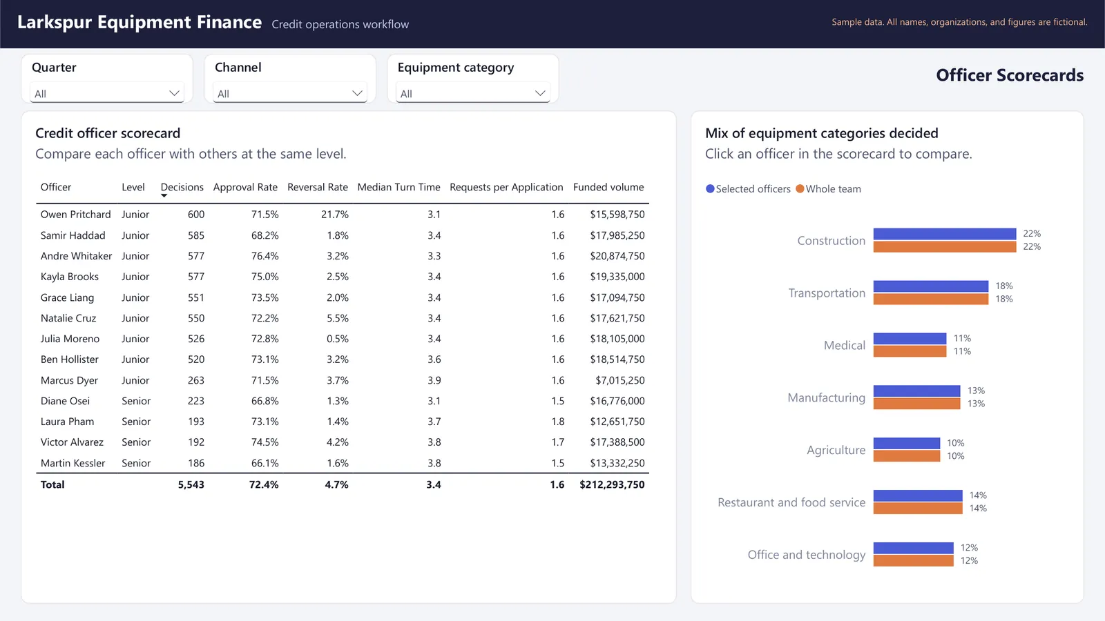
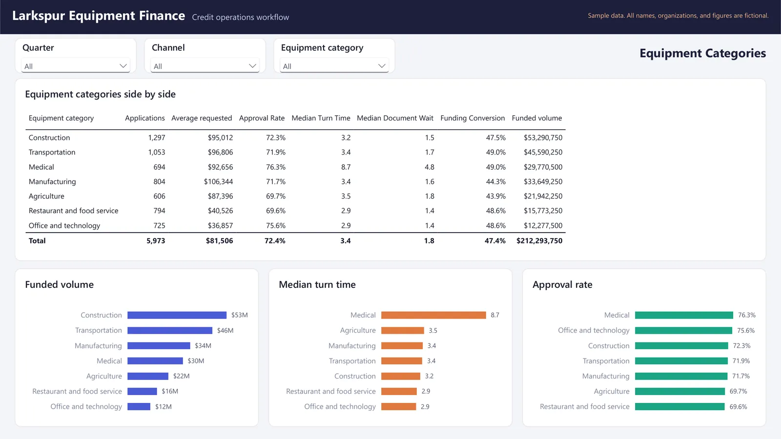
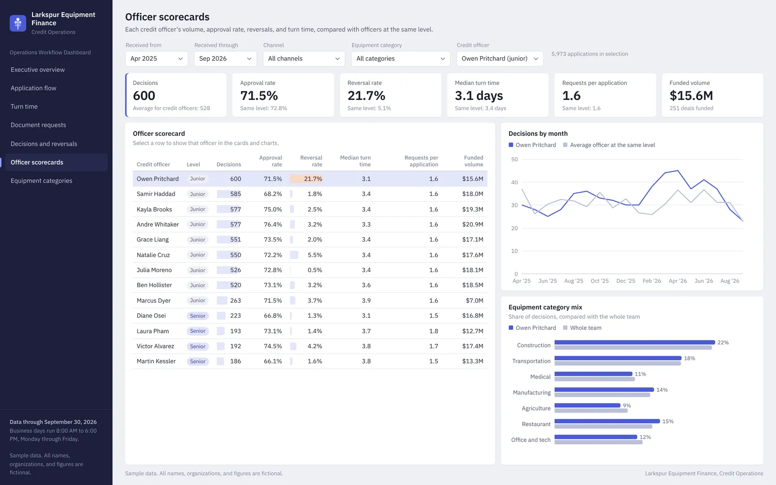
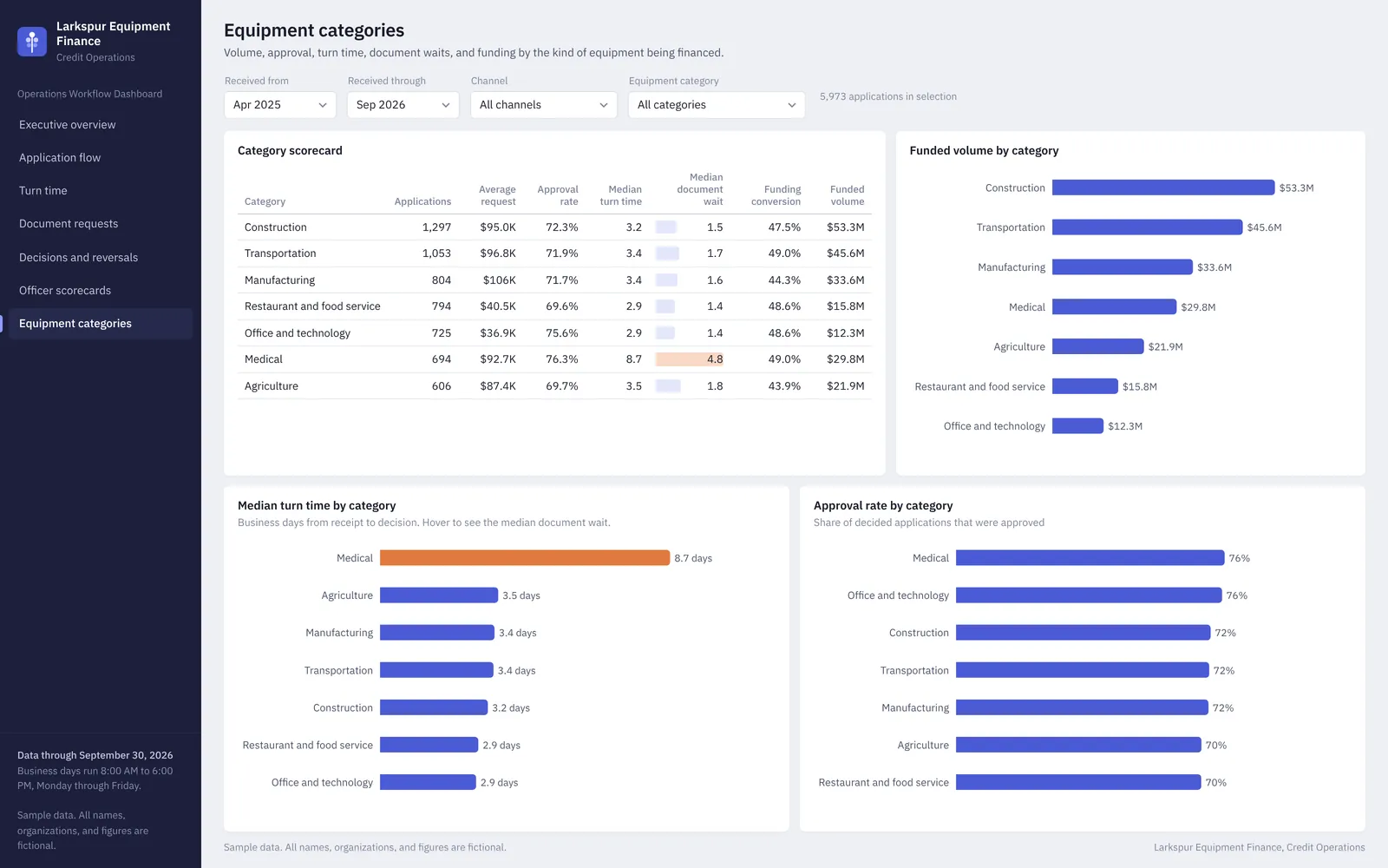
This dashboard gives a credit manager one place to see how applications move from receipt to funding. It covers an executive overview, the application flow with step conversion by channel, turn time and month-end decision waits, document requests by type and equipment category, decisions and reversals, scorecards for each of the 13 credit officers compared with officers at the same level, and an equipment category comparison.

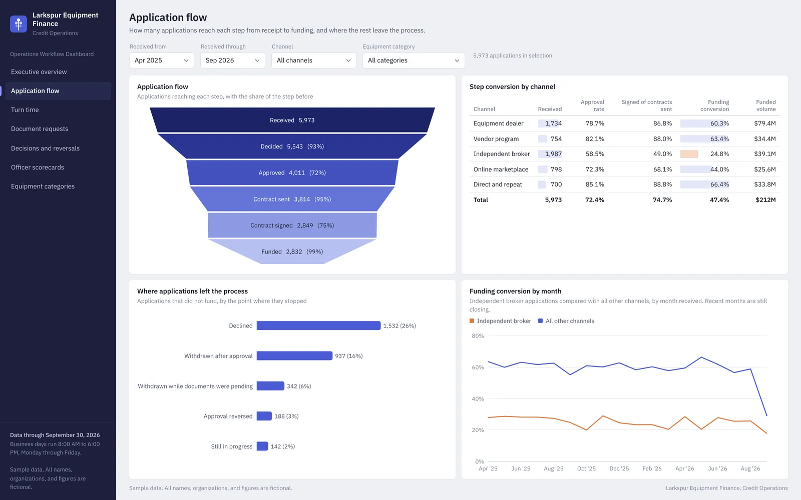
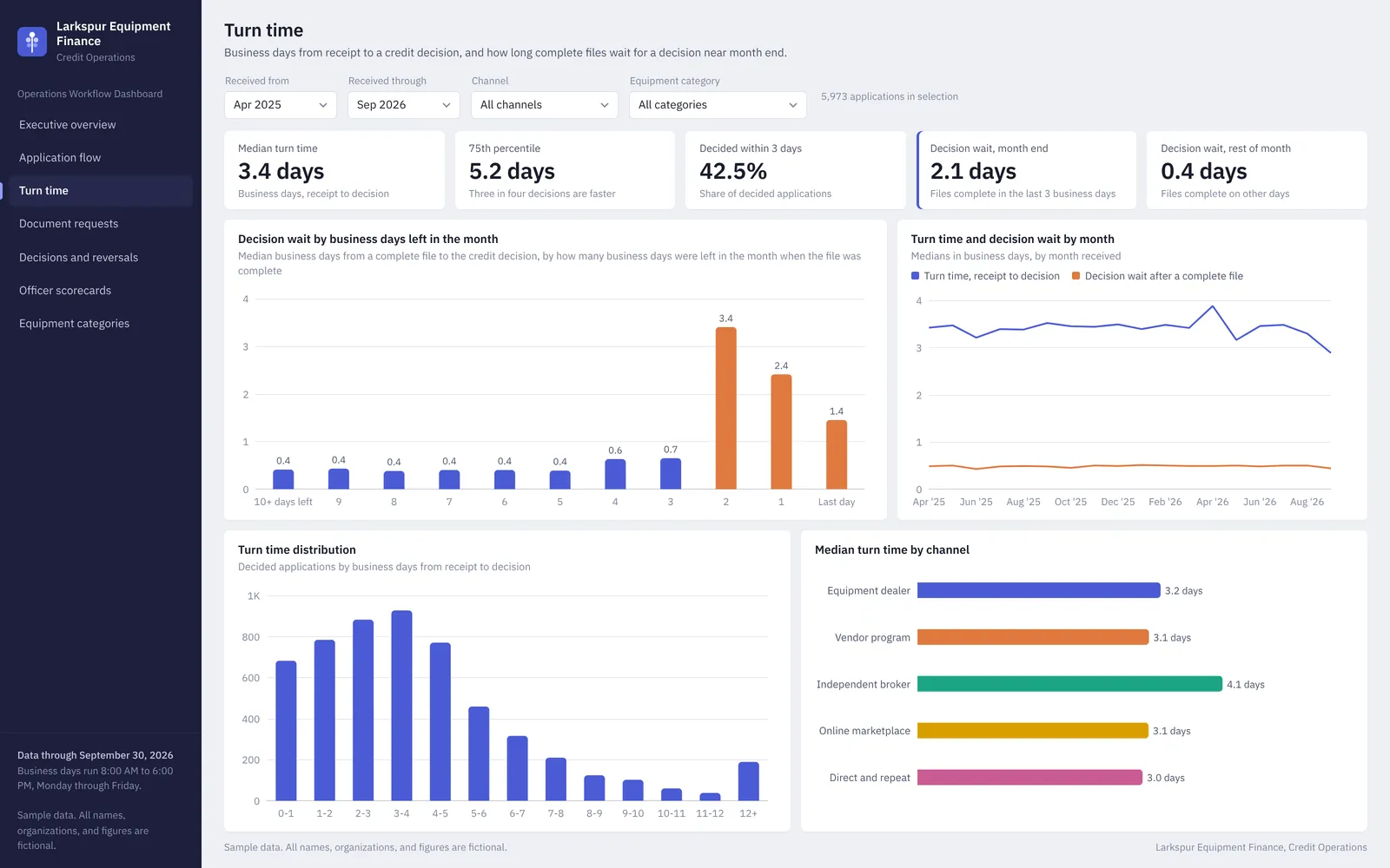
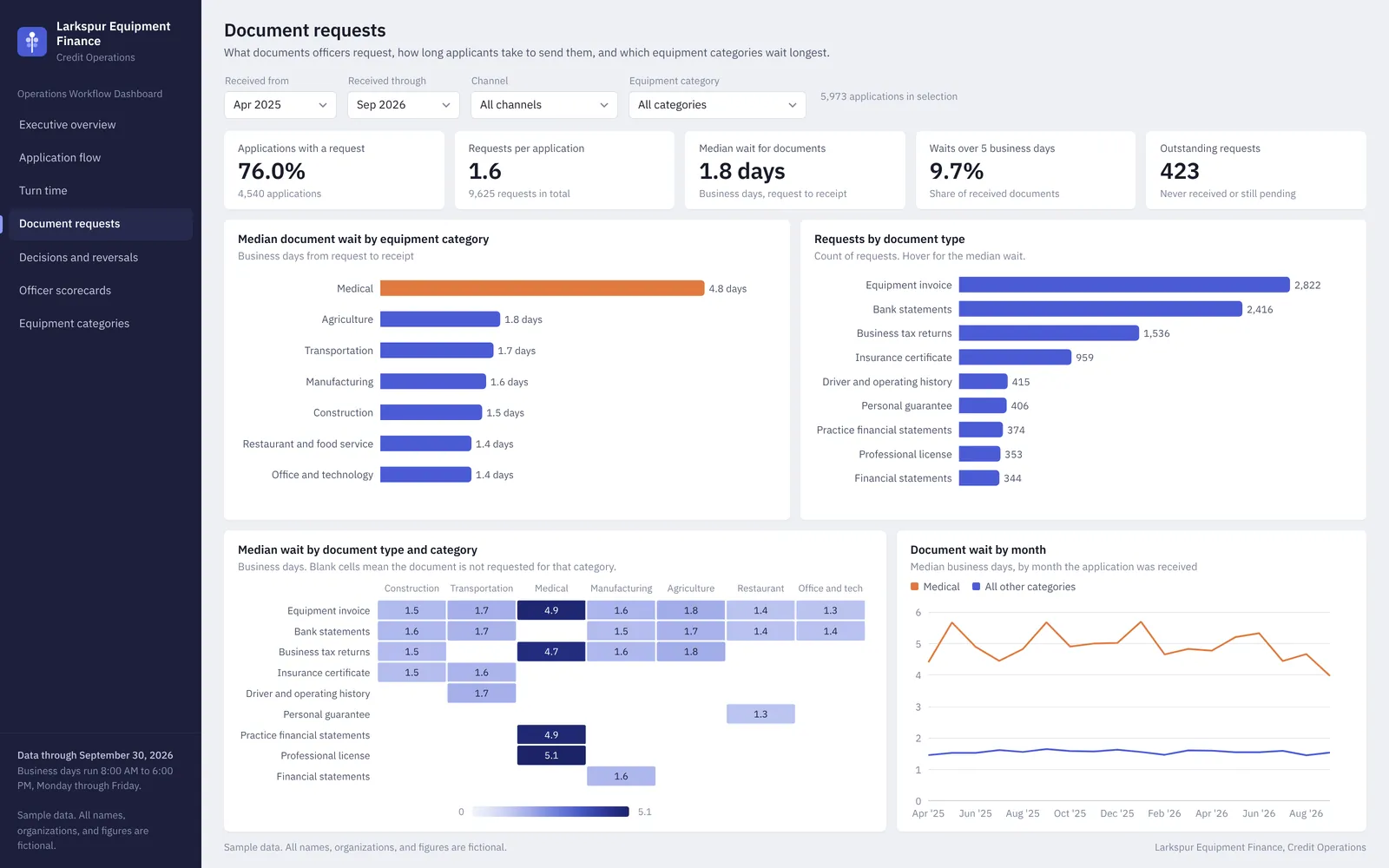
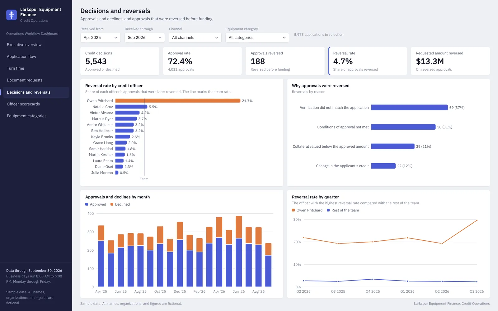
The sample data was built with four patterns a manager would want to catch. One officer's approvals are reversed before funding at about eight times the rate for the rest of the team, complete files wait about five times longer for a decision in the last three business days of each month, medical equipment applicants take about three times as long to send requested documents, and the independent broker channel sends the most applications but funds only about a quarter of them. The product includes clean data tables, a Power BI theme, and a rebuild guide with every DAX measure.
What it includes

  • A working Power BI report with eight pages, ten related tables, and 83 DAX measures, built in Power BI Desktop.
  • Seven pages with shared slicers for date range, channel, and equipment category
  • Application flow funnel with step conversion by channel and the point where each lost application stopped
  • Turn time page that measures how long complete files wait for a decision near month end
  • Document request analysis by document type and equipment category
  • Reversal rate by credit officer with reasons and a quarterly trend
  • Officer scorecards compared with officers at the same level
  • Rebuild guide with 42 DAX measures, relationships, and page-by-page visual settings

Screenshots

Select an image to see it larger.

More in Dashboards and Business Intelligence

County Health Profile: Upstate South Carolina

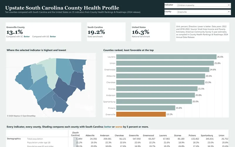
This is the secondary data profile from a community health needs assessment for ten Upstate South Carolina counties, and it is built from the 2024 County Health Rankings release. It compares 35 county indicators with state and national values and turns them into a dashboard, a 14-page report and an Excel workbook.

  • Excel
  • Tableau
  • PDF report

Public data

Community Health Survey Results

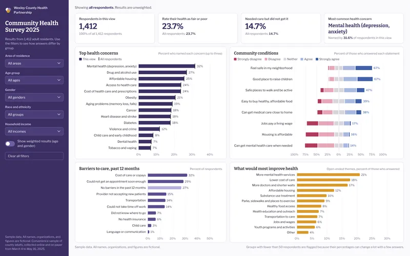
This sample analyzes a fictional county community health survey with 1,412 respondents, which is the kind of survey hospitals run as part of a community health needs assessment. It includes a filterable dashboard, an 8-page results brief and an Excel workbook with crosstabs, a codebook and weighting.

  • Excel
  • Power BI
  • PDF report

Sample data